Type a search term to find related articles by LIMS subject matter experts gathered from the most trusted and dynamic collaboration tools in the laboratory informatics industry.
 | |
| Industry | Printing |
|---|---|
| Founded | 1891 in Hammersmith |
| Founder | William Morris |
| Defunct | 1898 |
| Headquarters | |
The Kelmscott Press, founded by William Morris and Emery Walker, published 53 books in 66 volumes[1] between 1891 and 1898. Each book was designed and ornamented by Morris and printed by hand in limited editions of around 300. Many books were illustrated by Edward Burne-Jones.[2] Kelmscott Press books sought to replicate the style of 15th-century printing and were part of the Gothic revival movement.[3] Kelmscott Press started the contemporary fine press movement, which focuses on the craft and design of bookmaking, often using hand presses.[4] While their most famous books are richly decorated, most Kelmscott Press books did not have elaborate decoration, but were published simply.
Morris was interested in medieval book design, visiting the Bodleian Library often with Burne-Jones to examine illuminated manuscripts. He designed and published several books before founding Kelmscott Press. Book dealers and designers complained about the poor quality of books published on the new rotary printing presses; Morris agreed that their quality was poor. After attending a lecture by Emery Walker on book design, Morris was inspired to collaborate with him on a new font of type, and their collaboration led to the founding of the Kelmscott Press, named after Kelmscott Manor, Morris's home in Oxfordshire.
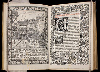
Walker enlarged photographs of fine typefaces for Morris to trace and take inspiration from. Morris then drew his new font design at the enlarged size, which Walker in turn reduced. All three of Morris's fonts were created this way. Morris loved the aesthetics of 15th-century books and modelled his margins and spacing after them. He put smaller spaces between words and lines to create a block of text, and had large outer margins where he put shoulder-notes. Some Kelmscott books were heavily decorated with woodblock designs created by Morris. To create the look of an uninterrupted block of text, Morris sometimes printed poetry as prose. Kelmscott Press's most famous book was its edition of the complete works of Chaucer. The Chaucer contains 87 wood engravings by Edward Burne-Jones and many designs and initials by Morris. The book is considered a masterpiece of the fine press medium.
The Press closed shortly after Morris's death, but has exerted a huge influence on book production throughout the world.[5][6]
Before Morris founded the Kelmscott Press, he had a strong interest in book design. Morris and Burne-Jones both admired illuminated manuscripts, and visited the Bodleian Library often to admire them. They also admired the works of Chaucer and Dürer. Morris carefully studied the techniques of the illuminators and the woodblock carvers in hopes of reviving that type of craftsmanship.[7] Morris had some experience in contributing to and designing books before he founded the Kelmscott Press.[8] He designed and illuminated books by hand, starting in 1870 with an anthology of his own poetry, A Book of Verse.[9] He designed as well as wrote The House of Wolfings (1889) and The Roots of the Mountains (1890); he also designed The Story of Gunnlaug the Worm-Tongue (1891).[8] He had plans to make a richly illustrated version of his epic poem, The Earthly Paradise. He abandoned the project, but surviving trial pages show that the typefaces and illustrations are "incompatible".[10]
Morris was not merely trying to replicate 15th-century printing practices. He preferred the iron hand-press of the 19th century to the medieval wooden ones, because the weaker wooden presses had to print on wet paper to get a print from a woodblock. Printing on wet paper weakened the press and subsequently, the book itself. Conveniently, iron hand-presses were still readily available in the 1890s.[11] While modern rotary presses focused on speed and affordability, Morris did not.[12] Some book dealers and designers disliked the newly popular, poorly-produced books. Talbot Baines Reed, in an 1890 lecture on typography at the Society of Arts, complained that new typefaces were thin, harsh, and lacking dignity compared to old-face typefaces like Caslon and those of Nicholas Jenson. Morris expressed similar opinions. [13]
Emery Walker, a book-collector, was friends and neighbours with Morris. In 1888, the Arts and Crafts Society sponsored several lectures including two by Walker on bookbinding and letterpress printing and illustration. His lecture included slides of books, including enlarged type[14] to demonstrate good and bad book design. After the second lecture, Morris asked Walker to make a new font of type with him. Walker was initially skeptical, since he could not contribute capital. Walker told Morris where to buy high-quality tools and materials for printing, as well as where to hire skilled printers.[15] In January 1891, Morris began renting a cottage near Kelmscott House, No. 16 Upper Mall in Hammersmith, which would serve as the first premises of the Kelmscott Press, before relocating to the neighbouring No. 14 in May, that same month in which the company was founded.[16] The Kelmscott Press was named after Kelmscott Manor, Morris's home in Oxfordshire.[17] While Morris did not pay himself any sort of salary, he usually broke even or made a little bit of money from the sales of Kelmscott Press books. Sales from smaller books, which were easier to produce and sell, supported production of folios and quartos.[18] Morris organised outings for his workers and paid them above-average wages.[19]
After Morris's death in 1896, Cockerell and Walker finished the last five volumes of The Earthly Paradise and ten other titles. Some had already been started or were in planning stages at the time of Morris's death.[20] They lacked the decorations that Morris usually created for Kelmscott books.[21]
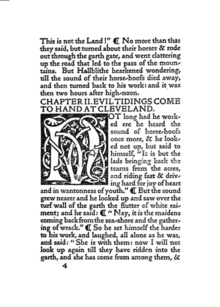

While the Kelmscott Press is most well known for its large folio of the complete works of Chaucer, complete with many wood engravings, most of the books Kelmscott Press published were octavos that were not illustrated. Morris believed that any printer could improve their design by using old-style types and placing the page of type closer to the spine than the outside edge, as was the custom in 15th-century printing.[22] Morris advised others to print without ornament, but he did not follow this advice when printing books at the Kelmscott Press.[23]
The hand press allowed Morris to use wood-engraved initials and borders, and its printing was blacker than a power-driven press. Morris printed on dampened handmade paper, creating indentations in the page.[24] Morris believed that the indentations were an important part of the book's design, telling customers that The Gold Legend should not be pressed, which would have made the pages artificially smooth.[25] Morris referred to selling books untrimmed and unbound, assuming that his buyers would rebind them. After finding out that most buyers did not rebind the books, Morris started trimming the deckle-edged edges after publishing Biblia innocentium.[24] While Morris and Walker preferred paper in their books, they printed several copies of books on vellum for collectors. Vellum was difficult to print on compared to paper.[26] Morris started using a thick, dark ink that came from a German supplier in Hannover in 1893. The pressmen had difficulty working with the stiff ink. Morris went back to using ink from Shackell, Edwards, and Co., until 1895 when they discovered yellow staining on some pages of the Chaucer. Morris asked the supplier in Hannover for a softer version of the ink, which he used for the rest of Chaucer.[27] The softer ink did not dry very quickly, and Morris told customers that the book would not be ready for traditional binding until a year after its printing. Morris used red ink for titles and shoulder-notes. He experimented with other colors, but did not adopt them.[28]
Walker influenced Morris's opinions on book design. In the 1880s, Walker supported a return to 15th-century aesthetics. He believed printers should put smaller spaces between words and after punctuation. Morris adopted the practice of smaller spaces between words and between lines, although it affected the legibility of the Kelmscott books. While the fifteenth-century books probably reduced spacing to conserve paper, Morris's insistence was based on his preference for the way the printed page looked with fewer spaces. Morris stated that the margins closest to the binding must be the smallest, followed by the head, fore (outer) and tail margins. Experts in medieval printing stated that the difference between the margins was usually less than twenty percent. [29] In practice, Morris's fore margins were large to accommodate the shoulder-notes recommended by Walker instead of running titles. Morris left so little inner margin that rebinding was difficult. Morris published poetry in a prose style several times, presumably to avoid empty space on the page.[30]
Morris designed three typefaces for Kelmscott Press: Golden Type, Troy, and a smaller version of Troy called Chaucer.[31] After deciding to found the press, Morris collected many books printed in the 15th century in Europe. He also had many books on printing and typography. In researching typefaces, Morris bought examples of every fine type he could find. Morris started designing his press's first typeface, Golden Type, by 1889. Walker's firm photographed the type at a large scale to help Morris see the actual shape of the letters.[32] Golden Type was a Roman type inspired by a font used in Pliny's Historicae naturalis published by Nicolas Jenson and a similar font that Jacobus Rubeus used in publishing Historiae Florentini populi by Leonardus Brunus Aretinus. Morris stated that designing Golden Type was "the most troublesome task" he had ever tried.[33] Morris traced the enlarged type until he felt comfortable with his understanding of the design. After freehanding his own design at the same scale, Walker photographed the drawings and reproduced them in the correct scale. Morris made modifications at every stage. Morris and Walker pioneered this method of working on typefaces at an enlarged size with the camera.[34] Peterson notes that even though Morris and the Kelmscott Press was focused on returning to 15th-century designs, they still used the modern Victorian technology of photography in its art.[35] Edward Prince, a craftsman who cut typefaces for many other fine presses, cut the punches for the type in 1890. Sir Charles Reed and Sons carried out the casting, and the font, in 14-point size, was completed in the winter of 1890–1891.[36] With Golden Type, Morris did not make an italic or bold version and did not include brackets or dashes. The thickness of the font went well with the wood-engravings it often accompanied. Critics noted that its larger size and width discouraged commercial application. Stanley Morison strongly disliked it and criticized its large capital letters.[37]
After Golden Type, Morris developed Troy, a "semi-Gothic type designed [...] with special regard to legibility", according to Morris.[38] Morris used the same method he used to develop Golden Type as he did with Troy. He was influenced by books published by Shoeffer and Zainer. His illness delayed the font's development and the 18-point font was completed in 1892. He developed a 12-point version of Troy for the complete works of Chaucer, also called the Kelmscott Chaucer. He called the font the Chaucer.[39] Because of these wide fonts, the books themselves had to be wide too.[40] Morris bought handmade paper from Joseph Batchelor and Son. They used watermarks designed by Morris and provided him with paper in unusual sizes. Other booksellers admired the paper, leading to imitators. At Morris's suggestion, Batchelor adopted the name Kelmscott Handmade.[41]
In the 1890s, photoengraving made it easy for entrepreneurs to copy Morris's typefaces and sell pirated typefaces. When an American foundry offered to sell Morris's typefaces in the United States, Morris refused. Joseph W. Phinney of the Dickinson Type Foundry in Boston sold a Jenson Old Style that was very similar to Golden Type. Satanick, an imitation Troy type, was available for purchase in 1896. Morris's own typefounders, Sir Charles Reed and Sons, started selling a Kelmscott Old Style type. Subsequently, Sydney Cockerell, the Kelmscott Press's administrator, threatened legal action against them.[42]
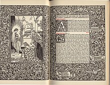
Some of the Kelmscott books are heavily decorated, with motifs similar to Morris's other designs for upholstery and wallpaper. In 1913, Holbrook Jackson wrote: "The Kelmscott books look not only as if letter and decoration had grown one out of the other; they look as if they could go on growing."[43] The title pages of Kelmscott books were usually decorated in a Victorian style.[31] Morris initially designed woodblock initials that were too dark or too large for the pages they appeared on, but later became more proficient in proofing his capitals.[44] The Kelmscott books varied greatly in ornaments; while The History of Godefrey of Boloyne is "over-decorated",[45] the first few books published by Kelmscott were sparsely decorated. Morris's border and capital designs were very similar to his wallpaper designs, and were not illustrative of the texts they adorned. While medieval texts had delicate illuminations covering their margins, the wood engravings Morris made in imitation of them were very heavy, and created production problems in the Chaucer, requiring the hand press to be reinforced with steel because of the weight of the large ornaments. [46] At times Morris preferred that his wood engravers replicated his designs exactly, even though this was at odds with John Ruskin's theory that craftsmen should have influence in the final aesthetic product they help produce.[47] Kelmscott books did not have printing on the reverse side of woodblock pages until the Chaucer, but this separation of text from illustration was precisely what Morris wanted to avoid in his book designs.[48]
Burne-Jones, a frequent illustrator of Kelmscott books, based many of his drawings for the wood engravings on his own previous paintings. He valued these works for their decorative value over their illustrative properties, and reviewed them by looking at them upside-down.[49]
Morris designed three different printer's marks for Kelmscott Press. One was a simple text mark in a rectangle used with octavos and small quartos. The Kelmscott mark with a large rectangle and leafy background was first published in The History of Godefrey of Bolyne and was used mostly for quartos. The last printer's mark was only used in the Chaucer.[50]
Kelmscott Press's first book was one of Morris's own novels, The Story of the Glittering Plain, which was published in May 1891 and soon sold out. The Kelmscott Press published 23 of Morris's books, more than those of any other author.[51] Morris used paragraph symbols instead of indentations to achieve the blocky looks that he preferred. Morris sold the first copy to Wilfrid Scawen Blunt for one pound. [52] Similar to the William Caxton's renaissance printing practice, Kelmscott Press printed editions of poetry, Morris's own works, and medieval romance and poetry.[31] Kelmscott printed an American edition of Hand and Soul by Dante Rossetti in 1895 which was distributed by Way and Williams Publishers.[53] The press published editions of works by Keats, Shelley, Ruskin, and Swinburne, as well as copies of various medieval texts.
William Morris's wife, Jane Morris, helped coordinate the publication of Wilfrid Scawen Blunt's The Love-Lyrics & Songs of Proteus (1892). Blunt had many amorous relationships with women, including one with Jane Morris.[54] Blunt often alluded to his relationships with specific women in his poetry. In a series of sonnets called "Natalia's Resurrection", a young man and a married Roman woman fall in love and can only be together after the woman's death. Jane liked the poems, perhaps seeing herself in them, and insisted that they be added to The Love-Lyrics & Songs of Proteus. Blunt's real inspiration for the poem was likely Margaret Talbot, a different lover of his. When Talbot read "Natalia's Resurrection", she insisted that the poems not be printed, and the 18 pages of poetry that were already set in type were removed from publication.[55]
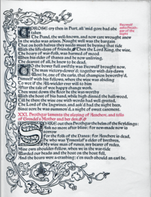
The Kelmscott Beowulf is considered Morris's "most problematic" book project. The text was based on A. J. Wyatt's prose translation. Morris adapted the translation into verse format, and made some of the language more archaic.[56] He developed the Troy font for the Beowulf. The 300 paper copies sold for about 2 guineas each.[56] Morris's biographer, E. P. Thompson, described it as "perhaps the worst thing he ever wrote" in 1991.[57] Beowulf translator James M. Garnatt was disappointed with the translation, stating that it was "bordering on unintelligibl[e]".[58] When the book was first published, Theodore Watts wrote in The Athenaeum that the work was a success.[57] Andy Orchard, professor of Anglo-Saxon at the University of Oxford,[59] noted that Morris's translation was very faithful to the original syntax and words, especially with the compounds he created like "shade-goer" and "horn-house".[60] According to Old English scholar Roy Liuzza,[61] Morris tried to re-create Beowulf in a type of English that was as removed from modern English as the vernacular speech of Anglo-Saxons was from the original Beowulf. In so doing, Morris avoided romance words and wrote in an elaborate medieval style that appears to the modern reader as "most obnoxious".[62] Nevertheless, Morris was trying to "make the poem speak to [him] in [his] own language."[63] The included glossary, which Morris did not want to include, was inadequate.[64]
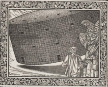
The Kelmscott Chaucer used Walter William Skeat's edition of the complete Chaucer,[66] after explaining to the delegates of the Clarendon Press that his edition was intended to be an "art object" and would not compete with their six-volume edition of Skeat's edition of Chaucer's complete works.[67] It contains 87 wood engravings of drawings by Edward Burne-Jones.[68] Burne-Jones refrained from illustrating Chaucer's "base stories" and avoided comical situations in his illustrations, believing that "pictures are too good to be funny".[69] He relied on his own interpretations of Chaucer for his illustrations, resulting in "a peculiar sort of literalism".[65] Burne-Jones's literalism appears in his illustration of the house made of "twigges" in "The House of Fame", which looks like a large wicker basket, and in the horse of brass in "The Squire's Tale".[70] After setbacks and delays, including Morris's own failing health, Morris changed the print run from 325 paper copies to 425. He sold them for 20 pounds each. 13 copies were printed on vellum and sold for 120 guineas each. The Chaucer was not profitable, and was subsidized by the profits from other books.[71]
Morris designed the title, 14 large borders, 18 frames for illustrations, and 26 large initials specifically for the Chaucer. Printing began on 8 August 1894.[72] Morris traced an issue with the paper staining yellow to his ink, and the issue disappeared after he received a softer version of the Hannover ink from the manufacturer. The stained pages were fixed by laying them in the sun.[73] Most editions of the Chaucer had a plain paper board binding, but 48 had a pigskin binding, which cost 13 pounds extra, and was designed by Morris and performed by Doves Bindery.[74]
Critical response to the Kelmscott Chaucer was effulgent, with reviewers in 1896 calling it "the finest book ever printed" and the press's "crowning achievement".[75] A library catalog compared its importance to the history of printing to the Gutenberg Bible.[76] Yeats called it "the most beautiful of all printed books".[77] An article on the Kelmscott Press in the Academy stated that it was "a great landmark in the history of printing".[78] According to Alan Crawford, a historian of the Arts and Crafts movement,[79] it was "like the Holy Grail tapestries: an intimate collaboration between Morris and Burne-Jones, their masterpiece in that particular medium, and their tribute to an early master of their imagination".[70] A few criticisms have been expressed alongside the effusive praises of the Chaucer. Peter Faulkner, a William Morris expert,[80] expressed his preference for The Canterbury Tales by the Golden Cockerel Press, noting that in the Kelmscott Chaucer "the two sixty-three-line columns of 12-point type on the large page do not make for easy reading".[81]
Critics of the Kelmscott Press note that fine press books are a part of commodity culture that is only accessible to the rich, which contrasts with Morris's socialist ideals. One of Morris's supporters, UC Davis professor Elizabeth Carolyn Miller, argues that Kelmscott was an attempt to create a utopian print space and that Morris's books were a criticism of mass print culture. Jeffrey Skoblow stated that Kelmscott books explored commodification as part of a Romantic-Marxist continuum.
Critics during Morris's time wondered why he made expensive books that were inaccessible to most people when he was a socialist.[82] Scholars have discussed the political implications of his work.[83] According to Elizabeth Carolyn Miller, the Kelmscott Press and the idea of fine press books stand as a utopian criticism of mass print culture. Morris's work aligns with the "idealist" aesthetic, which centers around the way the task of art uplifts humanity to approach an ideal. Aestheticism divorced this marriage of artistic ideals with ethical ones, postulating that artistic ideals are artificial.[84] Many critics of Morris see his work as part of the commodity culture that supported Aestheticism. Miller argues that Morris was working toward an ideal of production that made print a utopian space for post-revolutionary art.[85] Kelmscott itself, as a disruptive force in printing, is utopian in a way defined by Frederic Jameson—that a radical break from the status quo is "reinforced by the Utopian form".[86] Morris believed that the cultural impact of moveable type was not as considerable as people believed it was.[87] Miller believes that the form of the Kelmscott books is utopian: the sharp lines of the wood-engraved illustrations "insist on its material presence" while the leafy borders common in Kelmscott books recall their place in nature while clearly delineating the artificiality of the image.[88] The story of News from Nowhere described a utopia called "Nowhere", where communal discussion occurred in verbal discourse, textual communication being the language of bureaucracy. Verbal discussion is preferred in the story that book-making is dying out.[89] Kelmscott tried to separate readers from the present by immersing them in archaic and futuristic production values.[90]
Thorstein Veblen, in his Theory of the Leisure Class (1899), called Kelmscott's books a "conspicuous waste",[91] arguing that they were less convenient and more expensive than regular books, showing that the purchaser had time and money to waste. Linda Dowling and William Peterson saw Morris's work at Kelmscott as being less political than his other work.[92] Jeffrey Skoblow argued that the "rigorously materialist impulse" in the Kelmscott books was part of "a great Romantic-Marxist continuum" that explored commodification.[93]
After the closing of the Kelmscott Press, leftover paper and the type fonts were given to the Chiswick Press; however, the Kelmscott types were sold to Cambridge University Press in 1940 and later, made part of the Cambridge University Library. Ornaments and other woodblocks were deposited in to the British Museum.[94][95] The presses and accompanying equipment were sold to C. R. Ashbee's Essex House Press.[78]
Ashbee imitated the Kelmscott Press in his press company, the Essex House Press. He used the same ink, paper, vellum, and presses that Kelmscott had used. He also commissioned wood engravings and created two of his own typefaces, named Endeavor and Kings Prayer Book. William S. Peterson, an English professor at the University of Maryland and a Morris scholar,[96] called Ashbee's typefaces "ugly and eccentric" but stated that the books themselves "have a certain period charm".[97] Their most important work was the Prayer Book of King Edward the Seventh.[98] Pamela Todd, an art historian,[99] describes their books as "beautiful" and achieve "the same powerful effect as Morris".[100] The Essex House Press printed 83 books, but was not able to compete with machine-press books in the Kelmscott style.[97]
Cobden-Sanderson worked as a binder in the Doves Bindery, which carried out the pigskin bindings for the Kelmscott Chaucer.[98][74] Together with Emery Walker, Cobden-Sanderson founded Doves Press and used similar paper and vellum to Kelmscott. Cobden-Sanderson disliked the decorative style of the Kelmscott books; books from the Doves Press had only an occasional calligraphic initials.[101] They created a font that copied fonts in Nicolas Jenson's renaissance publications.[102] Their 5-volume folio Bible remains an important landmark in the history of fine press, and their editions of Goethe inspired the formation of several fine presses in Germany. The most prominent of these were Bremer Press, Janus Presse, Kleukens Presse, Ernst Ludwig Presse, and Serpentis Presse.[98]
The Vale Press, founded by Charles Ricketts with Charles Shannon, based their types on 15th-century calligraphy. They published literary classics, which allowed them to focus on the design and layout of the works. The Eragny Press shared type with Vale for a time and was famous for Lucien Pissarro's illustrations.[31] The Ashendene Press published many beautiful books over a period of 40 years. They published poetry books and folio versions of classic literature.[103] Dun Emer Press was founded by Elizabeth and Lily Yeats in Dublin.[104] These presses, that valued workers as craftsmen, reacted against the Industrial Revolution's devaluing of human labour. Many of the fine press founders had socialist or anarchist opinions, and Kelmscott books were discussed in radical press.[90]
Kelmscott also influenced fine presses in the United States. Kelmscott Press's Hand and Soul inspired American printers, and the decorative style in The Altar Book (1896) by Daniel Berkeley Updike shows striking similarities to the Kelmscott Chaucer.[105]